Deccan Herald, Bangalore.
Monday, April 18, 2005.
Teeming: D. Narahari's "Rhythm of Colours" exhibition (KCP, April 7 to 13) in his words, was meant to recreate the original effect of now ruined Temples and damaged scriptures.
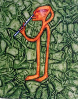
To be honest, it would have been dificult to guess this on one's own. The actual paintings by this self-taught local artist let the spectator perhaps think of naive or folkloristic inspirations.
True, there are plenty of tranditional iconography and ornamental motifs in his imagery, however all that becomes transposed onto the sort of dense, decorative mesh whose repeated accents and wider compositional lines on the flat which represent the pulsating structure of archaic and village idioms echoing of the feel for the inner build and behaviour of the world. Even the kaleidoscopic use of bright hues indicates the same.
The rows of slightly varied, stylized heads and other shapes add to it while suggesting an intense and innocent absorption. However interpreted, the images have a certain charm. Whereas the multihued works may be somewhat simplistic and the larger figures sometimes awkward, the more evidently drawing based and mutated, monochromatic images truly appeal to the eye and the heart.
- Marta Jakimowicz

 Deccan Herald, Bangalore.